Reports only work if people actually use them
You can spend hours polishing a Power BI report, but if no one engages with it, all that effort is wasted. A good report doesn’t just look nice. It should help people understand the story behind the data and guide them through it.
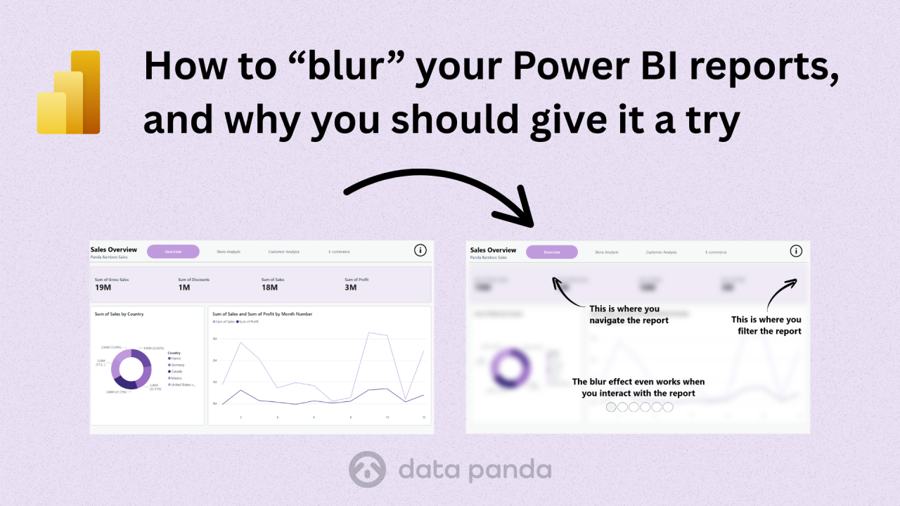
Sometimes, you need a little trick to focus your users’ attention. One simple way to do that is by adding an overlay that explains or highlights certain parts of the report. But what if you could make it even more effective by blurring the background so the focus stays on what matters?
That’s what this little experiment is about.
The idea: a blur effect inside Power BI
You’ve probably seen this effect on websites. When a menu or pop-up appears, the background gets slightly blurred or gets this 'frosted' effect. It helps users stay focused on the content in front of them.
And here’s the fun part: Power BI is built on the same kind of web technology as modern websites. That means we can use a small piece of HTML and CSS to recreate that blur effect right inside Power BI.
(If you ever made a website in FrontPage or Dreamweaver, this might feel like a blast from the past.)
Step 1: Use the HTML Content visual
To make this work, we’ll use the HTML Content (Lite) visual by Daniel Marsh-Patrick. It lets you add bits of web code inside your report.
You can find it in the Power BI marketplace. Choose the “Lite” version because it’s certified and works in most environments.
Step 2: Add the blur
Next, we’ll add a short piece of HTML. If you don't know where to start writing the HTML you can always use the help of AI. Open you favourite AI assistant like ChatGPT or Copilot and launch a prompt like this:
Write html code to render a div element that takes up 100% of the available space both horizontally and vertically and that blurs all the underlying elements. Return the html for a single div. Add all the CSS inline. I want to use it in Power Bi html visual.
The result looks like this:
<div style=" position: fixed; top: 0; left: 0; width: 100%; height: 100%; backdrop-filter: blur(10px); -webkit-backdrop-filter: blur(10px); z-index: 9999;"></div>
Add this code to a measure. Don’t forget to escape the double quotes by doubling them up.
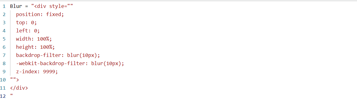
You can adjust the blur strength by changing the number inside blur(10px) to a higher or lower value.
Step 3: Format the visual
Add the HTML Content (Lite) visual to your report.
Drag your measure into it.
In Visual settings > General > Effects, turn off the background and border.
In General > Properties > Padding, set all sides to 0px.
Position the visual so it covers the full report area. You should now see your blur effect come to life.
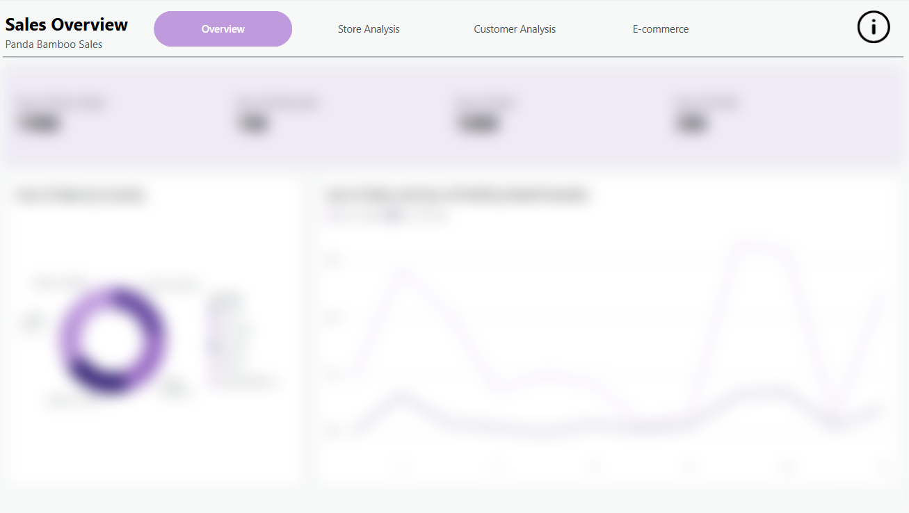
Please note that the effect might not be visible in Power Bi Desktop. Sometimes it looks like nothing is happening. But when you publish your report to the Power Bi Service your blur effect will come to life.
Step 4: Make it interactive
Of course, you don’t want your report permanently blurred. The idea is to activate it only when users click an info icon or open a help overlay.
Here’s how to do that:
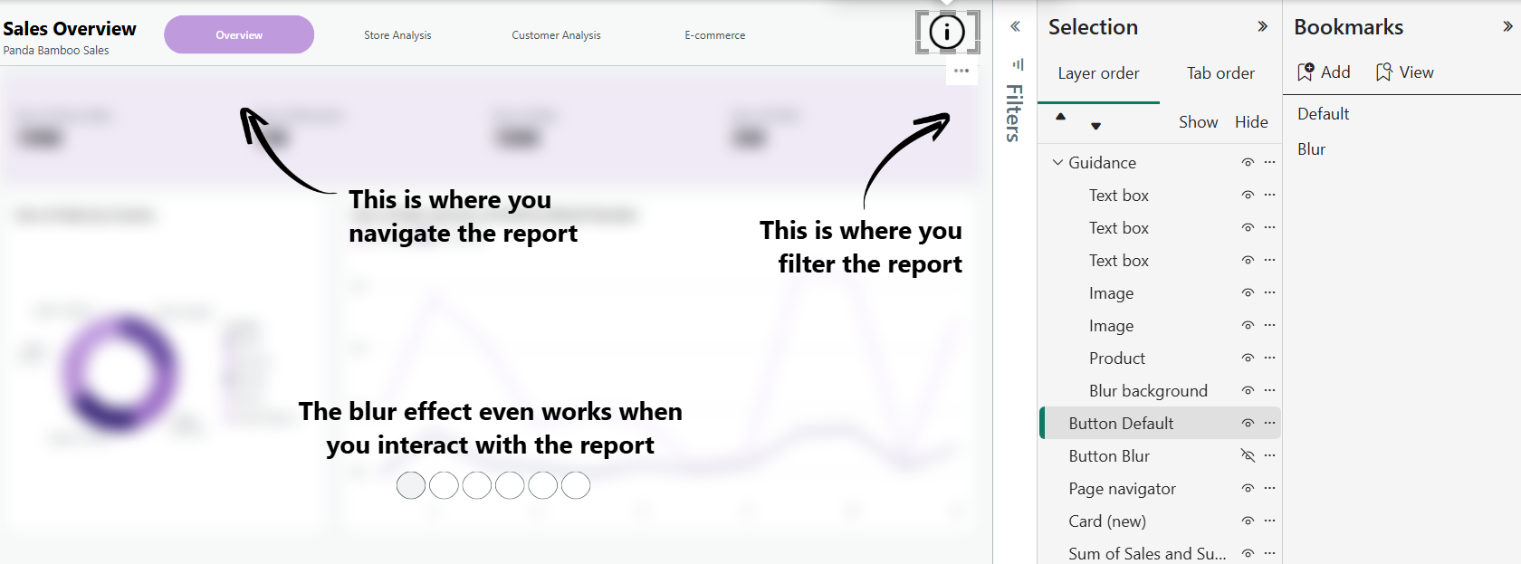
Create two bookmarks, one for the Default state and one for the Blur state.
Group your guidance elements and the HTML blur visual in the Selection pane so they can be shown or hidden together.
Add two buttons with info icons. The first one activates the Blur bookmark, the second returns to Default.
Click the button, and watch the effect in action.
Power BI gives you a lot of room to be creative. Once you realise it’s powered by web technology, a whole new world of small design tweaks opens up. With just a bit of HTML and curiosity, you can build more interactive, polished, and user-friendly reports.
A blur effect might sound like a small detail, but it can make your reports easier to navigate and more enjoyable to use.