Data storytelling
What is data storytelling?
Data storytelling is the craft of taking a finding buried in your data and communicating it so clearly that the people listening know what it means and what to do about it. It joins three things: the data itself, a visual that makes the pattern easy to see, and a narrative that says why it matters. A chart on its own shows a number. Data storytelling puts that number in context, points at the part that counts, and connects it to a decision.
The gap it closes is a familiar one. An analyst spends a week on the numbers, drops a busy chart into a slide, and the room nods and moves on with nothing changed. The analysis was fine; the communication was not. Seeing data and acting on data are two different steps, and most value is lost in the space between them. Data storytelling is the work of crossing that space on purpose.
Cole Nussbaumer Knaflic made the case for this in her book Storytelling with Data, arguing that presenting numbers well is a communication skill, not a charting feature. The core idea is that a good data story has a shape, a beginning that sets up the situation, a middle that shows the tension in the numbers, and an end that lands on what should happen next, rather than being a flat wall of figures.
The three ingredients
A data story needs all three parts working together, and it is usually clearest to think of them as jobs rather than features.
Data. The finding has to be true and it has to matter. No amount of presentation rescues a point that is wrong or trivial. The story rests on sound analysis underneath.
Visuals. The right chart makes the pattern obvious at a glance, and only shows what supports the point. A line for a trend, a bar for a comparison, and everything that distracts stripped away, so the eye goes straight to what matters.
Narrative. The words that carry meaning: what changed, why it happened, what it costs or earns, and what to do. Narrative is what turns a correct chart into a reason to act.
Drop any one and the effect falls apart. Data with no narrative is a spreadsheet. Narrative with no data is an opinion. A striking visual with neither is decoration.
Data storytelling versus a dashboard
A dashboard and a data story do related but distinct jobs, and confusing them leads to weak versions of both. A dashboard is built for monitoring: it shows the current state of many metrics at once and lets the viewer draw their own conclusions, day after day. A data story is built for a moment: it makes one specific point to one specific audience, and it argues towards a decision.
The clue is the direction of the work. A dashboard hands the interpretation to the reader. A data story does the interpretation for them and tells them what it found. You would build a dashboard to track weekly sales; you would build a data story to explain why last quarter missed target and what to change. The same figures can feed both, but they are shaped differently because they are asking the audience to do different things.
How to build a data story
Start with the audience. A finance director, a warehouse manager, and a board want different levels of detail and care about different outcomes. Decide who is in the room before you choose a single chart.
Settle on one message. If you cannot say the point in a sentence, the story is not ready. A presentation with five equal messages is really no message. Pick the one that matters most and build around it.
Give the number context. A figure alone means little. Sales of 40,000 is a triumph against a target of 30,000 and a worry against 60,000. Show the comparison that tells the reader whether to be pleased or concerned.
End on the action. Close with what you want to happen: a decision to make, a budget to shift, a process to change. A data story that stops at insight leaves its own work unfinished.
What to watch out for with data storytelling
A story can mislead as easily as inform. The same techniques that make a point land, a cropped axis, a flattering time range, a carefully chosen comparison, can also bend the truth. Persuasion built on a distorted chart is manipulation, and it eventually costs you the audience's trust. Make the honest point well rather than a false point beautifully.
Do not confuse decoration with narrative. Adding an illustration or a dramatic colour is not storytelling. The narrative lives in the argument, in what the numbers mean and why the reader should care, not in the styling.
Cutting is the hard part. Analysts want to show all the work. An audience wants the conclusion. Everything that does not serve the one message weakens it, however interesting it was to produce. Leaving things out is most of the skill.
Keywords
data storytelling
business intelligence
dashboard
kpi
self-service analytics
power bi
data visualisation
data literacy
bi
From the blog.
More pieces from the field on the same topic.
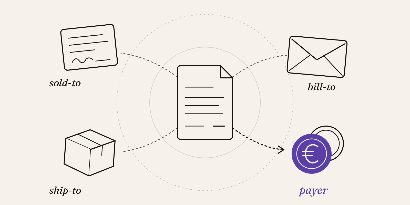
Sold-to, ship-to, bill-to and payer in SAP: who is actually your customer?
Sold-to, ship-to, bill-to and payer in SAP explained with a concrete example: who gets the invoice, whose account the receivable sits on, an...

New Data Panda connectors in August 2026
Seven new Data Panda connectors from August 2026: ECB rates, ProfitPlus Webshop, SAP S/4HANA, Exact Venice, OpusFlow, ABAX and Sprout Social...