Dashboard
What is a dashboard?
A dashboard is a visual display of the most important information you need to reach a goal, gathered onto a single screen so you can take it in at a glance. The name is borrowed from a car: the driver does not read a manual to check speed and fuel, they glance down and see the state of the vehicle in an instant. A business dashboard does the same for a team or a process.
Two ideas do the heavy lifting in that definition, and both come from Stephen Few, who set out the widely used version of it in his book Information Dashboard Design. The first is a single screen: everything you need is visible at once, with no scrolling and no clicking between pages, because the value is seeing it all together. The second is at a glance: a dashboard is for monitoring, for spotting quickly whether things are on track or need attention, not for detailed reading.
Few also makes a point that is easy to miss: a dashboard is a form of presentation, not a type of data or a piece of technology. The same numbers could appear in a spreadsheet or an email. What makes something a dashboard is that it is arranged for monitoring at a glance. That is why a good dashboard shows a handful of things that matter rather than every number available.
Operational, analytical, and strategic dashboards
Dashboards are not all doing the same job. Stephen Few splits them into three kinds by purpose, and knowing which one you are building settles most design questions.
Operational dashboards
These monitor activity as it happens and are read many times a day. A support team watching open tickets, wait times, and queue length wants a live or near-live picture so it can react in the moment. The emphasis is on now: what is happening, and does anything need attention right away. Speed and clarity beat depth here.
Analytical dashboards
These help someone understand why, by comparing across time and slicing the data different ways. They tend to support interaction: filtering, and drilling down from a total into the detail underneath. An analyst exploring why margin slipped last quarter needs to poke at the numbers, so an analytical dashboard is built for that back-and-forth rather than for a single glance.
Strategic dashboards
These give managers and executives a high-level view of the health of the organisation against its goals. They are usually reviewed on a slower rhythm, weekly or monthly, and lean on KPIs, the small set of measures that show whether the business is heading the right way. The focus is the big picture over time, not the events of the last hour.
Dashboard versus report
A dashboard and a report are often set against each other, and the difference is one of purpose rather than tools. A dashboard is for monitoring: a compact, visual, at-a-glance view of the current state, meant to be checked often. A report is for detail: a fuller document, often many pages, laid out to be read through, with the exact figures, breakdowns, and footnotes.
A useful test is what happens when you need the precise number for row 4,000. On a dashboard, you would not: it is not built to hold that. That is the territory of a paginated report, the print-ready, pixel-perfect format made for exactly that kind of complete, itemised output, the invoice, the statement, the regulatory filing. Dashboards answer how are we doing at a glance; reports answer give me every number in full. Most teams need both, for different moments.
Where dashboards are built
Dashboards are the headline feature of business intelligence tools. Power BI is the common one in the Microsoft world, alongside tools like Tableau and Looker, and most of them now lean towards self-service analytics, letting people build their own views rather than waiting on a central team. The tool matters less than the discipline: a dashboard in any of them succeeds or fails on whether it shows the right few things clearly.
What to watch out for with a dashboard
More is less. The strongest pull in dashboard design is to add just one more chart, and every addition costs the reader attention. A screen crammed with twenty visuals hides the three that matter. Decide what the dashboard is for and leave off what does not serve it.
Pick metrics people can act on. A number that looks impressive but changes no decision is clutter with a nice font. Every metric on the screen should connect to something the reader can do about it.
Design for the glance. If understanding the dashboard takes a paragraph of explanation or a legend hunt, it has stopped being a dashboard. Titles that state the point, sensible defaults, and restrained colour do more than any single clever chart.
Wrong beats missing. A dashboard people trust becomes the truth in the room, so a stale or miscalculated figure on it does real damage. Check the numbers feeding it as carefully as you design the view showing them.
Keywords
dashboard
business intelligence
kpi
power bi
paginated report
data storytelling
self-service analytics
data visualisation
bi
From the blog.
More pieces from the field on the same topic.
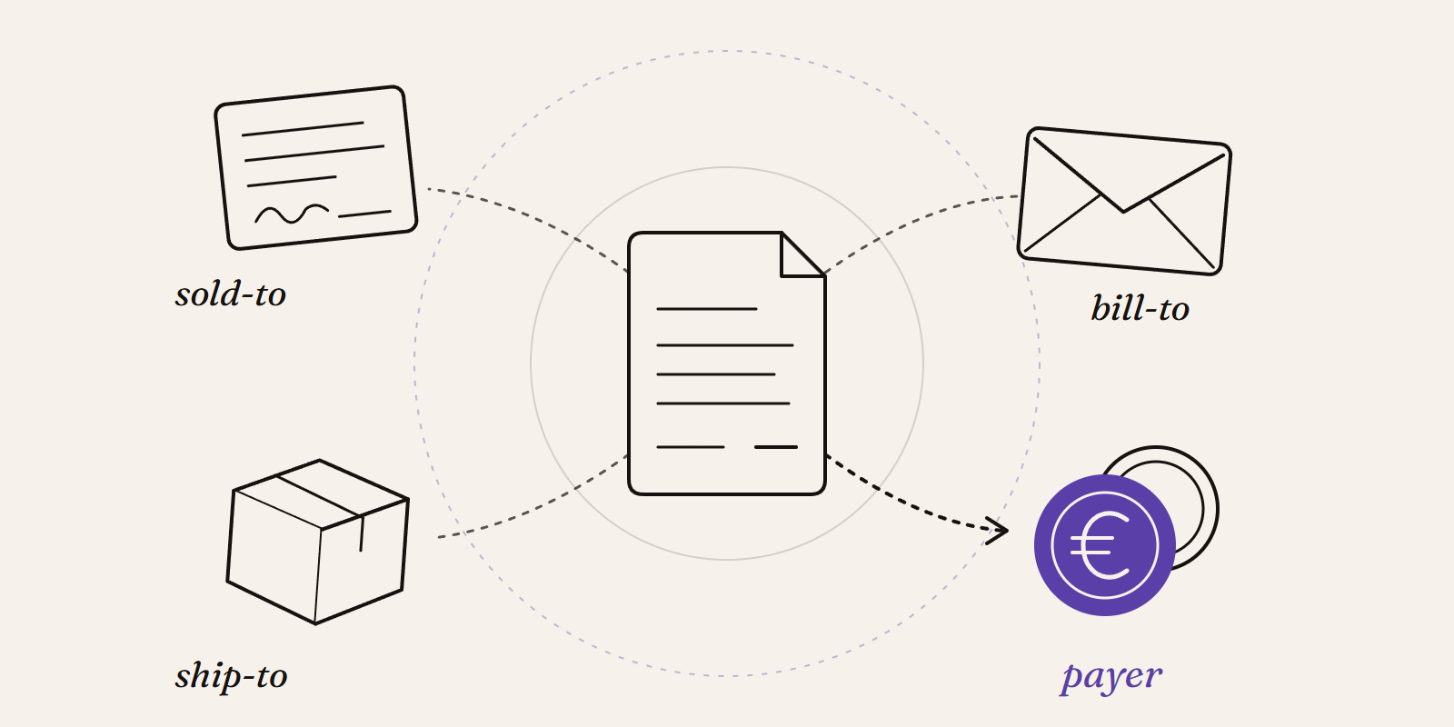
Sold-to, ship-to, bill-to and payer in SAP: who is actually your customer?
Sold-to, ship-to, bill-to and payer in SAP explained with a concrete example: who gets the invoice, whose account the receivable sits on, an...
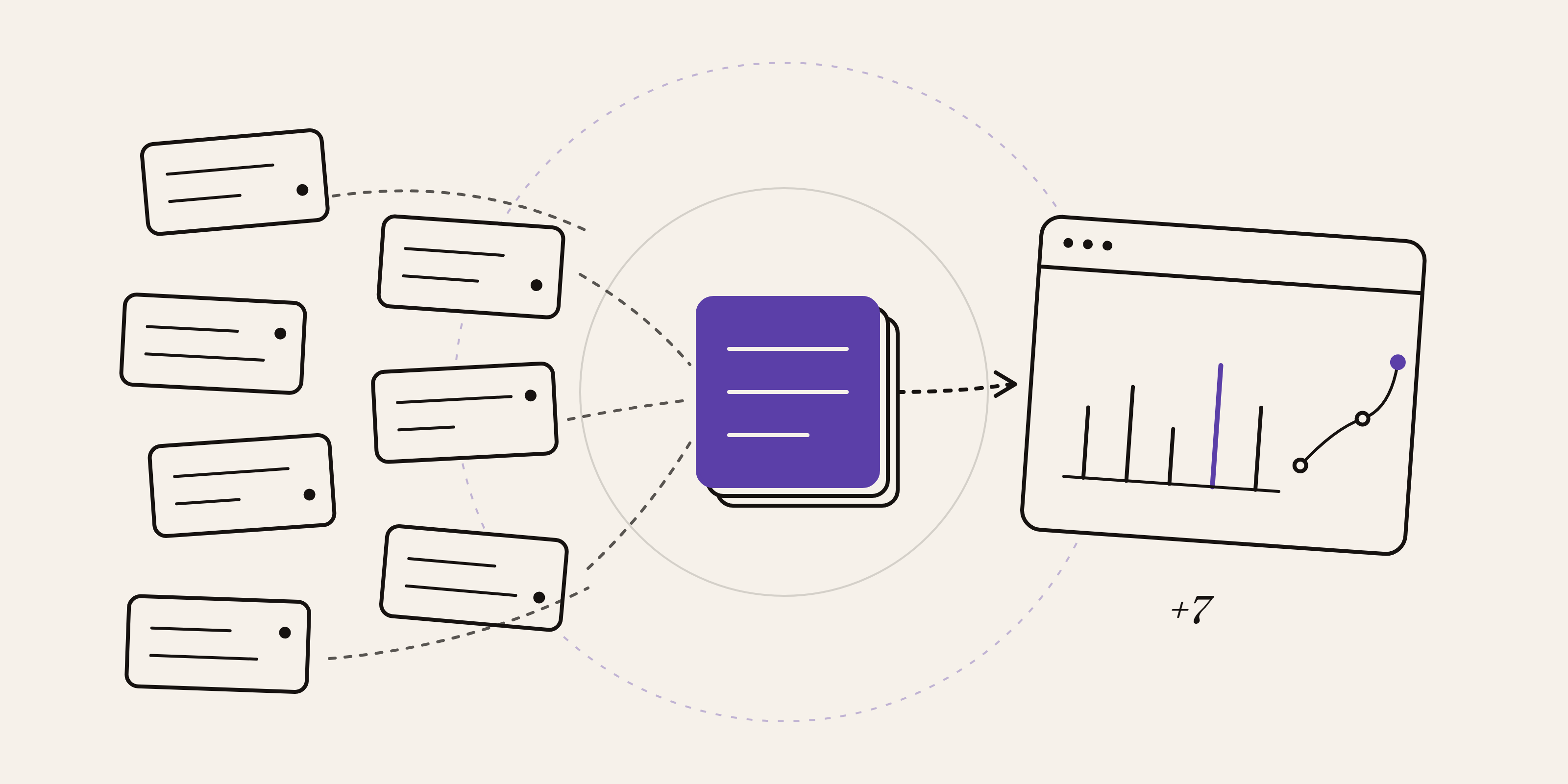
New Data Panda connectors in August 2026
Seven new Data Panda connectors from August 2026: ECB rates, ProfitPlus Webshop, SAP S/4HANA, Exact Venice, OpusFlow, ABAX and Sprout Social...