ROC curve and AUC
What is a ROC curve and AUC?
A ROC curve shows how well a classification model separates two groups, the positives and the negatives, without you having to fix a decision threshold first. It plots the true positive rate on the vertical axis against the false positive rate on the horizontal axis, and it draws one point for every threshold the model could use.
The true positive rate is the share of real positives the model catches, TP / (TP + FN). The false positive rate is the share of real negatives it wrongly flags, FP / (FP + TN). As you lower the threshold the model flags more cases, so both rates climb together and the curve travels from the bottom left to the top right.
AUC is the area under that curve, a single number between 0 and 1. Because the curve already covers every threshold, AUC describes the model's ranking ability on its own, which is why teams reach for it when a model outputs a score or probability and the cut-off has not been chosen yet. It is one of the standard scores for a supervised learning classifier.
What the AUC number actually means
AUC has an exact meaning that makes it worth using. It equals the probability that the model gives a higher score to a randomly chosen positive than to a randomly chosen negative. An AUC of 0.90 means that if you draw one real positive and one real negative at random, the model ranks the positive above the negative 90 percent of the time.
That gives you three anchors. An AUC of 0.5 is a coin flip: the model orders positives and negatives no better than chance. An AUC of 1.0 is perfect ranking, every positive scored above every negative. Below 0.5 means the ranking is inverted, and a model that lands there is often useful once you flip its predictions.
Take a fraud model that assigns each transaction a risk score. An AUC of 0.94 tells you a genuine fraud case outranks a clean transaction 94 times out of 100. That is a statement about order, not about the raw score itself, and it holds whatever threshold you later choose.
Reading the curve across thresholds
Every point on a ROC curve is one threshold, and each threshold produces one confusion matrix. Move the cut-off and you trade the two error types against each other. Set it low and the model flags almost everything: you catch nearly all the positives but raise many false alarms, so both rates sit high. Set it high and alarms get precise but you miss real cases, so both rates fall back toward the origin.
The curve draws that whole trade-off as one line. A model whose curve bows toward the upper left reaches a high true positive rate while its false positive rate is still low, which is the shape you want. The diagonal from corner to corner is the coin flip again: no threshold on that line beats guessing.
Where AUC flatters an imbalanced model
The false positive rate divides by every real negative, FP / (FP + TN). When the negative class is huge, that denominator swamps the numerator, so even a lot of false alarms produce a tiny false positive rate and the curve still looks excellent. Under heavy class imbalance, AUC flatters the model.
Say 10,000 transactions contain 100 fraud cases and 9,900 clean ones. At one threshold the model flags 200 transactions and 80 of them are really fraud. The true positive rate is 80 of 100, a healthy 0.80. The false positive rate is only 120 of 9,900, about 1.2 percent, so this point sits near the upper left and the AUC reads high. Yet of the 200 flagged transactions only 80 are fraud, so precision is 40 percent and more than half of every alert is a false alarm.
ROC never surfaces that, because it never asks how many of the flagged cases were right. A precision-recall curve does, because precision and recall both stay on the positive class and ignore the large pool of easy negatives. When the positive class is rare, the honest picture for fraud detection, medical screening, or churn scoring comes from the precision-recall curve, not from AUC alone.
How to use AUC well
AUC earns its place when you want to compare models before committing to a threshold, as long as you score them on the same test set. Beyond that, keep three limits in mind.
It does not pick your threshold. A good ranking is not an operational decision. The cut-off depends on what a false alarm costs you against what a missed case costs, and that is a business call, not a property of the curve.
It says nothing about calibration. AUC only cares about order. Whether a score of 0.8 really means an 80 percent chance is a separate question, and a model can rank well yet report probabilities that are far off.
It hides the class balance. An AUC quoted without the share of positives tells you little, and the same number can mean very different things on a balanced and an imbalanced test set.
For everyday scoring in predictive analytics or anomaly detection, read AUC next to a confusion matrix at your chosen threshold, and track it over time so model drift shows up before it costs you.
Keywords
ROC curve and AUC
AUC
ROC
machine learning
supervised learning
predictive analytics
confusion matrix
precision and recall
class imbalance
classification
model evaluation
From the blog.
More pieces from the field on the same topic.
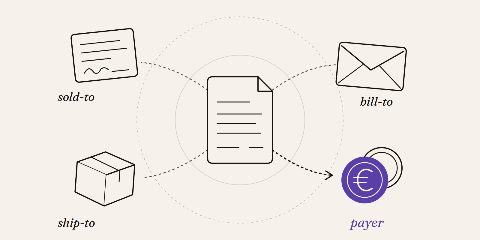
Sold-to, ship-to, bill-to and payer in SAP: who is actually your customer?
Sold-to, ship-to, bill-to and payer in SAP explained with a concrete example: who gets the invoice, whose account the receivable sits on, an...
New Data Panda connectors in July 2026
Seven new Data Panda connectors from July 2026, with practical applications for inspections, cash flow, planning, projects, equipment and si...